David McCandless is a London-based author, data-journalist and information designer, working across print, advertising, TV and the web.
David McCandless’s design work has appeared in over forty publications internationally including The Guardian, Wired and Die Zeit. Recently, he has championed the use of infographics and data visualizations to explore new directions for journalism and design – and to discover new stories in the seas of data swamping and surrounding us.
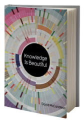
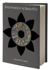
His blog and book, Information Is Beautiful explore the potential of data visualization as a new direction for journalism and story-telling, dedicated to visualizing ideas, issues, knowledge and data – all with the minimum of text.
The use of infographics, data visualizations and information design is a rising trend across many disciplines: science, design, journalism and the Internet. At the same time, daily exposure to the web is creating an incredibly design-literate population. Could this be a new language?
David McCandless shares his passion for the exciting potential of this merging of design, information, text and story, and unveils some of the interesting, unexpected and sometimes magical things that happen when you visualize data, knowledge and ideas. Admitting that his book is as full of mistakes as it is successes, he also explores some of the common pitfalls, traps and FAILS that dog this nascent design form.
Questions? Contact Us Any Time:
805.965.1400
info@bigspeak.com
More About Speaker, David McCandless . . .
Information is beautiful, and in an age of high-speed living and info-overload, visualized information has incredible potential to help us quickly understand, navigate and find meaning in a complex world.
Using examples from his book and blog, David McCandless shares his thoughts on what makes successful information visualization as well as journalistic tips, especially for designers, on how to zero in on interesting data and subjects – and how designing information exposes your own biases and changes your views about the world. When you visualize information in this way, you can start to see the patterns and connections that matter, and then design that visual information so that it tells a story, or conveys a message, focusing only on the information that’s important or interesting.

